Recently, all our closet shelving came crashing down in the middle of the night. It sucked. But I’m taking the opportunity to install a way better system than the cheap janky poorly-installed one that the previous owners had put in. And I need help!
After some useful Facebook input, I opted for The Container Store’s Elfa system. Even though it’s kind of expensive compared to some other systems, it’s worth it to us to buy the system that can be installed by someone else, since the main blunders we’ve made in home ownership involve attempting to mount things in the wall and failing. Boo. So we’re doing Elfa in platinum. Here’s an example closet that’s hilariously perfect looking!
I’m sort of tempted to take the opportunity to turn our closet into some weird glam corner of seductive mystery (probably in part because I’ve been looking at pictures like this one; it doesn’t help that half their stock photos have like an overstuffed armchair and a lamp and a fucking birdcage inside the closet). After all, this may be the only time since we moved in that I’ll completely remove everything in it, leaving the walls open for some sort of design revamp, you know? And a walk-in closet feels like a safe fun space to go a little design crazy, since it’s not as prominent as any other area in the house. And who doesn’t want a little fun when they get ready in the morning?
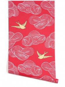 My first thoughts leaned towards wallpaper. I love the idea of wallpaper *right now* somewhere in our home, but I’m sure that my desire to trend-proof will mean that I’m regretful of it down the road. A closet seems like a less regret-prone space than, say, a bathroom or hallway. So I was thinking this Hygge and West pattern, that’s super cheery and fun and bright and on clearance! Great, right?
But then I asked Grant about it and he summed it up well that this is something that looks like a very specific era (i.e. like 2008, my guess not his) and that we’d be sick of it in ten years. Which is totally true, and while not tragic, it’s kind of annoying, right? I mean, I’m not going to want to strip and redo it then. And it DOES read as something incredibly au courant as of like four years before we even bought the house. Already dated; move on.
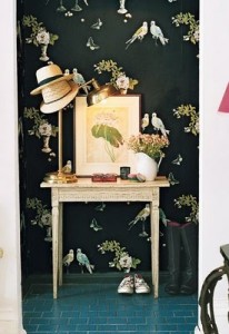 My next inspiration was Nina Campbell’s Perroquet wallpaper, which while stunning is probably insanely expensive and way too girly for Grant’s taste. I mean, he’d let me steamroller him into putting this up, but I’d always feel a TINY bit guilty about it.
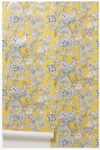 A close runner-up in the “vaguely avian Chinoiserie” category included this Anthropologie paper (one of their less expensive) which I love but has similar girliness and timelessness concerns, plus I dunno about the yellow.
 And then there’s something super Asian and saturated, like Schumacher’s Chiang Mai (inspired by bossy color). But then this is ALSO probably ungodly expensive, and I don’t like the knockoff nearly as much. Even though it is more masculine feeling (at least to me, dragons over birds) I still suspect Grant will find it a) too Asian, b) too busy, and c) too bright.
 If I had all the money in the world, I would get some Sheila Bridges stripey wallpaper in this orange color and install it everywhere, walls AND ceiling, and be done with it, because our master bedroom is already orange and black and white and JUST LOOK AT THIS AWESOMENESS. (Sheila Bridges is, like, Domino fancy – I first learned of her via her Harlem Toile de Jouy design in their magazine/book/somewhere, and some silly part of me loves having a *recognizable designer something* in our home even though I logically know that’s ridiculous for non-rich people.)
I just can’t spend $175 a roll right now; sorry Sheila. It’s a stretch to even do the Elfa system given that in the space of one month, our car broke down, our closet shelves crashed, our washer leaked so we need a new one AND we need to spend money repairing the damage we can’t DIY from that, AND we took two trips to see two friends get married which involved paying for two hotel stays. Sigh. No badass bold stripes for moi, nor any other designer elements. Those Hygge & West and Anthropologie wallpapers are probably my only viable options price-wise, which made me start leaning away from paper since those are my least favorites.
PLUS, the walls and ceiling in our closet are full of crazy cuts and angles, which make it insane to wallpaper, AND I realized that I’d be covering up most of the walls with clothes, which sort of makes wallpaper cost and effort pointless, unless I only did the ceiling, which is an option since it’s huge and sloped and prominent, but is still maybe more work than it’s worth and maybe more expense too since it’s hard to get smaller quantities of nice wallpaper.
SO. Now I’m thinking painting. But not, like, painting the whole room, because a) I’m lazy (I can rope my mom into helping with wallpaper but not necessarily paint although I haven’t tried that hard yet, see “lazy” above) and b) I can’t think of a single specific color that I would want to do. BUT I saw this weeks ago in my RSS reader, and I kind of love it.
It’s this super organic pattern that Shauna from Beautiful Matters did by hand, and I think it has a cool bold organic yet modern vibe and would be some work, sure, but actually seems less annoying than actually painting the room – I could leave the blah contractors’ beige in there and even do the stripes in a metallic that would play well with the platinum shelving.
But I showed this to Grant and this is what he said:
I think that idea is much better than the execution.
Like, I don’t think it looks bad, but if I went through that much work I would want it to look much better.
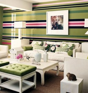 I totally get what he’s saying, but I’m not sure I … care. I pressed him and I think it mostly means that his taste gravitates towards a more regimented, taped-off intentional stripe look. But, like, Shauna’s project seems WAY easier than taping and painting bold stripes. But then maybe I’m crazy! Maybe tape WOULD make doing stripes super duper easy! And I’ve always loved this one green stripey room by Mary McDonald; maybe I should try to paint THAT!?
Should I paint weird hand-done vertical stripe thingies like this in the closet? Should I tape and paint (or free-hand) a more graphic stripe like that Sheila paper I love so much or this Mary room I love so much? Should I just leave it blah beige since it’s JUST A CLOSET? NO I can’t do that, not when I roped my mom into assisting me in transforming it.
Please assist me in making a decision so I can make my closet punchy and fun, people! I welcome your ideas. :)

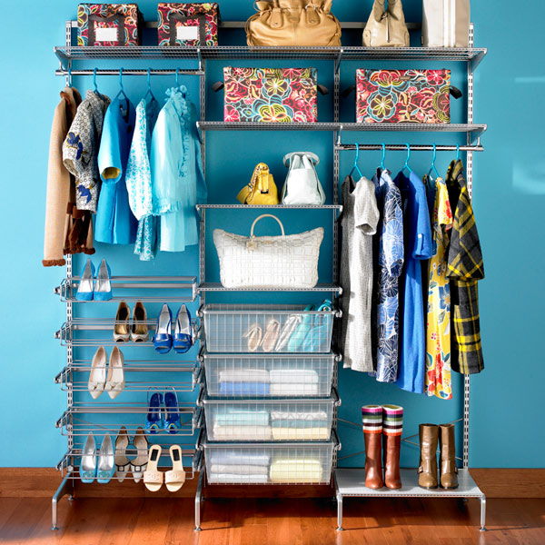
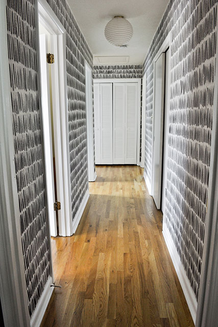
Thanks to Bess and Alexia for their Elfa input last time! And let me clarify, the reason I want to make the walls cool is that it will NEVER look great in terms of pretty storage baskets, lounging chairs, etc. It’s a mostly utilitarian space. So my wall choice is my one shot to jazz it up a bit!
Nudging my fave bloggers in case they chime in… @em_henderson @bossycolor @mariakillam @makingitlovely @jennykomenda http://t.co/UdnSZL5cAR
Oh oh, and I totally want Lora’s input too here! She’s possibly the only one who’s actually seen the space.
@askvirginia My first thought is: don’t do bold wall color, unless you KNOW it won’t interfere with your outfit planning.
@kittienumnums See, that was another concern. Which made me maybe want to just paint the walls charcoal gray or even black.
@askvirginia Second thought: organic or measured patterns could work well in a small space. You could sketch one of each on two areas.
@askvirginia I’m madly in love with light to medium grey right now. Especially in warm tones. Colors pop more than against white.
@askvirginia Final thought: that black and gold wallpaper is tragically gorgeous.
@kittienumnums BUT let me warn you: Gray is trendy. You THINK it’s timeless and neutral, but @mariakillam knows best.
@kittienumnums Which, the Nina Campbell one with the birds? I KNOW. I had only seen it online until this amazing Brooklyn boutique. Sigh.
@askvirginia @mariakillam I know it’s made the trend list lately but I’ve loved it since… 2001? If I was painting, I’d do it.
@kittienumnums Not the one pictured, but this other one. I had to full-on ask the clerks before I could continue gaping. They were tickled.
@askvirginia That’s a pattern that could convince me wallpaper is worth it. Though I have no idea where I’d use it.
I love love love the wallpaper.
Any paper in particular? :)
paint your own “spripy wall paper” and you won’t have to take it down in the future if you end up getting sick of it. that’s my vote. i love that orange/grey look.
The black wallpaper with birds! Haha!
Sorry, I am a little dippy from wisdom teeth removal. <3
oh i am getting to the “lazy” part. i’m slow. i’m slow because i’m trying to decide if v did indeed give me a black eye. also, don’t be lazy.
Noooooo! not AGAIN Lora!
ok now i’m to the part where tape will make you less lazy. paint it.
I just spent a lot of time & money removing wallpaper. It’s a bitch to get off, so don’t do it unless you know you’re going to still love it in 10 years. Future you will thank you.
Ha! That’s a very good thing to remember, Karen! Future Me thanks you.
I love it too Annie. But it’s so expensive that there’s not even a price listed, haha. And there’s Grant’s masculinity to keep in mind. :) Lora I think I *am* going to do some sort of bold stripe thing with paint! You and Karen inspired me!
NAILED IT http://www.ichetkar.fr/shop/fr/cats/77-cats.html
It seems fairly bonkers to wallpaper it. These papers are lovely, but what a faff! If I were you, I’d paint it.
@askvirginia I dunno about paint colors, but Elfa has worked well for my craft room shelves. And I installed it almost by myself.
Tape off stripes and do something inspired by the Bridges wallpaper you love so much!
Thanks Nicole! But NEW PLAN EVERYONE! Grant actually agreed to the Nina Campbell Perroquet in black. So I’m painting the walls black, wallpapering the ceiling, thrifting for a glitzy low-profile chandelier, and using the rest of the paper on this other room in the basement. HOORAY for straight men comfortable with feminine décor, haha.