I’m wearing a new coat today. I’m in love with my new coat. It was a splurge financially, even on clearance, and it’s impractical as all hell since my chubby arms don’t fit into it as well as I would like. But I bought it anyway for the glorious, high-contrast piping. I LOVE PIPING. (OK, maybe it’s more like edging, but you get the idea.)

I loved piping even before I started seeing coats like this in the goop newsletter and on The Good Wife and on other people in real life, and I’m confident I’ll still love piping when these jackets are no longer widely available. But this got me thinking about design trends, and how susceptible I can be to what’s currently en vogue as opposed to what I inherently like in a more timeless way. I’m slow to warm to most trends, so I start liking them when they’re past their peak, so to speak, rhyme not intended. So. What are some other motifs or design elements that I have always loved and expect to love forever?
Things I loved before they were cool, and will love forever (probably):
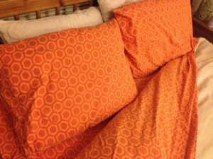
 Hexagons. Sure, they are popular in rugs and mugs now, but they’ve been around for a while. I don’t love these ‘gons religiously in a Battlestar Galactica cut-the-corners-off-every-damn-rectangle-ever kind of way, I just think they’re a beautiful motif. They kind of symbolize nature and organization, Ã la beehive, and they’re a nice crisp fairly masculine pattern that helps offset girlier elements. I got these sheets a few years ago from The Company Store well before the hexagon motif trend had blossomed, and I seek more hexagonal joy in new design acquisitions. I like other ‘gons too.
Turquoise. Not the watered-down teal that Pantone voted 2010’s color of the year. Don’t get me wrong, that’s nice and my office is that color, but my truly favorite flavor of turquoise is bluer and a bit darker (and unsuitable for walls in a northern-facing room). I can pinpoint the origin of my obsession perfectly ” my mom had a Hang Ten brand polyester cap-sleeved T-shirt with a scoop neck and those little Hang Ten feet embroidered in white on one shoulder. Total 70s piece. I inherited that shirt in early high school, or maybe 8th grade, and I was in LOVE. I was too self-conscious of my body to even wear it without overalls over it (shut up; they were in) but I loooved it and I got so many compliments when I wore it because that color just sets me ablaze somehow. I glow like a pregnant lady in bright blue-based turquoise, and I love it ” it’s at once calming and jazzy, outgoing and serene. Totally timeless (it’s come in and out of fashion several times since then, which is convenient since I never plan to stop wearing it!).
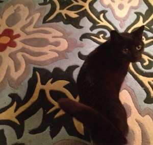
 Art Nouveau. There was a real Renaissance of Art Nouveau-styled posters when I was in college, but I was drawn to Nouveau stylings even before the trend-cauldron that is a women’s college, and that aesthetic has stuck with me through the years as probably my most girly taste. I love the look” when I visited Paris during my junior year of college living abroad in Barcelona, I felt lost in joy just staring at the iconic Metro signs with botanical streetlights. The Catalan modernism that surrounded me in Barcelona was awesome, of course, but the even more florid Art Nouveau was the design movement that really captured my heart. It still does. I wish I could get away with more Nouveau in our home design, but I don’t think Grant’s aesthetic is quite that verdant or feminine, if you will. However, I think Nouveau is why I pushed so hard to purchase this Moroccan temple-insipred rug (tomcat included for scale) which he eventually agreed to. Success!
Gray. The trend towards gray as the hot (cool) new neutral is well documented, but I was into gray clothing before then solely because it flatters me. I look really, really good in gray; something about my skin tone just plays well with it. Gray eye shadow flatters my blue eyes best. Gray mascara is a softer look than black which matches my hair better than brown. I bet I look amazing when my hair starts going gray someday. I lived in my J. Crew gray turtleneck senior year of college. It just works on me. I admit that as home designs go, I’m as susceptible to the trend as everyone else though. We haven’t yet actually painted any rooms gray, but we’re totally gonna, and yes, I know we’ll regret it when some other neutral starts to make gray look dated. Oh well! Side note: I am not a consistent speller of “gray” over “grey,” which you’d think I would be given how clearly picky and opinionated I am. Go figure!
 Owls. Look, I know they’re trendy, but they’re my alma mater’s unofficial mascot so I get to have a shitload of them with trend immunity, OK? You can have a bajillion bearcats or Spartans or whatever. I won’t judge. Owls are wise and cute and they can turn their heads all the way around and you can’t do that and shut up.
Herringbone, and kind of chevron, but NOT zig-zag. Perhaps we need a mini tutorial to differentiate herringbone, chevron and zig-zag, yes? I think we do. In my often wrong and extremely opinionated mind, herringbone has the V tines alternating, usually with a minor strip down the middle that would be the spine of said herring. Chevron would have a seam down the middle so the V tines have something specific to meet at, but the tines would be matching color. Zig-zag would be up and down Vs with no seaming or middle lining, Ã la Charlie Brown’s shirt. Here’s a hasty MS Paint tutorial that I didn’t think to search for the equivalent of! Hope you like primary colors!
Anyway, I *like* herringbone and I mostly like chevron, particularly in clothing. I don’t care for zig-zag AT ALL. Somehow the absence of that center element gives it a distinctly kiddie feel, which isn’t my thing unless you’re decorating a nursery. And even then, it’s too sharp and graphic for my taste in kiddie things. And of course, these are WAY overdone in home design right now, and most of the home design I see is actually zig-zag anyway and not herringbone or chevron. Herringbone to me is supposed to be grown-up like this and chevron to me is supposed to be kinda graphic and 70s-trippy like this. In summary: f— a zig-zag. That shit needs to end already. Unless you are Charlie Brown, in which case, you’ve been through enough and I’ll leave you alone (but still blog snidely about you).
Things I’ve always hated:
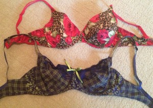
 Combined patterns. OK, to be fair, I totally own these two crazy patterned bras. But I like the bottom one and HATE the top one ” I kind of bought the top one ironically because it is the TRASHIEST pattern combination imaginable! Why is it that I like the one and hate the other? Well, the bottom/good one has three different patterns that are separate fabrics, juxtaposed but not shoved into one fabric. The top one has two disjointed patterns shoved together to make them attempt to coherently work as one pattern. This is a sin. Simple, right? (I never said I was easy to understand. And now I’m a weird lady who puts her bras on the Internet.)
Lettuce edge. I’m surprised I don’t see this somewhere in my fashion rules. I do hate it a lot, and always have. I think I inherited this distaste from my semi-seamstress mom; however, that’s funny because she also hates raw/unfinished edges and I don’t mind those so much. Interesting which insanely strong tastes we inherit from our parents, eh?
 Stupid seagrass things. As I reiterated here, I think they look dumb and are dust traps and are generally a fleeting trend that costs quite a lot of money. Just look at this dumb chair. It is dumb and will look even dumber in five years, plus imagine if you spilled something on it. Shut up. Go buy a regular chair, you tool. It looks really uncomfortable too.
Clear lamp bases, when you can see the cord. That’s just dumb. Why would you want to see that? I guess that sort of falls slightly under Industrial Chic, but I specifically hate this a lot (and so does Grant; for once we agree) because it seems like a very very silly and fleeting look that people will immediately hate. And so far in my lamp-shopping experience, which started maybe three months ago in an illuminatory frenzy, I have determined that lamps are expensive enough that you should not buy stupid trendy fleeting ones.
Sunburst mirrors. It’s not that I hate sunburst mirrors (or sunburst clocks or sunburst picture frames), but they aren’t particularly functional as mirrors since the reflective part is so tiny, and I just think they’re wildly overdone right now. Some overdone things are still inherently gorgeous, like the Arco lamp, but I’m over the sunburst trend. Especially if it costs you more than like $50. Go find a funky boldly-framed something that’s more unique. When everybody does some sort of mid-century-modern craze like this, it becomes homogeneous and boring.
Thing I used to hate but have turned around on:
Pearls. I used to think pearls were oh so old fashioned and possibly 80s, but I came around on them. I think that, like most design elements, trends come and go, but I’ve come to think of pearls as a timeless classic. So much so that I wore them on my wedding day, and everyone thought they looked swell (including me).
 Hearts. I used to think (and constantly say) “Hearts are for sissies!” but now I’ve come around. Especially on really cute ones like this adorable Etsy print. I think I mostly objected to shitty boring Valentine-style hearts, or heart doilies, or ugly heart birthstone necklaces or something. But yeah, hearts have a place in my… heart now. (Look, where did you think I was going with that sentence? Shut up.)
Industrial chic. I was slow to warm to this design trend, and I still think it can be done really dumb ” bare Edison bulbs are annoying to look at, and you should see the fugly cheap-looking lighting fixtures they used in my old Amazon office building. But all in all, I’m becoming OK with elements of this. Paxton Gate in Portland has some of the coolest steampunk-taxidermy-art I’ve ever seen, and I guess I kind of lump steampunk in with industrial because, you know, gears. See what I mean? I acquiesce to the trends only once they’re past their prime. (Ooh, minor Amazon pun.)
Animal print, especially colored. For a long-ass time I thought leopard print just SCREAMED “creepy, leathery-skinned cougar lady with frosted lipstick, covered in costume jewelry, and reeking with the stench of desperation and too much overpriced perfume.” But then I kinda started to like it. (Must be getting older, eh?) I’ve decided that, when done appropriately, leopard and other animal prints don’t have to be totally gross. You just have to keep it within reason. Much like how showing off the girls means a longer hemline, if you wear leopard print, you should avoid combining it with huge gleaming Vuitton logos, dark enormous sunglasses, ridiculous bombshell hair or eyeliner, lots of exposed skin, and/or red, yes even lipstick, unless it is Halloween or some other theme party. I was also initially bothered by the logical fallacy of animal prints on colored backgrounds like bright blue or pink, but then I started feeling like those were kind of more punk than cougar, and that’s more my comfort zone, so I’m in. Fine. I have a blue and black tigery top and a blue gray and black leopardy scarf. Sue me. And if you’re looking to lower the cougar factor of an animal print look, borrow a simple rule from nature: go herbivore. Zebra print and the recently-popularized giraffe print are WAY less cougar-screaming than anything off a big cat. You’re welcome.
One shoulder (kinda). I really really really really hated when this first started coming back during my middle school years. (Only amongst the hip vintage crowd, but still.) I’m now okay with some sleek, otherwise-simple one-shouldered dresses; however, do NOT come near me with just one sleeve. That’s just stupid and you look like you were in a brawl and if you like I will tear off your other sleeve so you match, you silly silly woman. (Men, even gay men, never do this. Bless them.)
Edit: I also wrote this follow-up post with more design loves/hates that occurred to me.


I’ve spent the past two years misidentifying zigzags as chevrons. I blame wedding blogs.
As you should. By the way, I’m baffled—I tried to disable comments because of commenters who are the opposite of you, but apparently I failed. :) Oh well!
Aaaaah hahaha. I just noticed that the favicon for my site is totally zigzag, because I was messing around to see how small you could get the pattern and still have it discernible. Foiled by my own testing!